Well, football shirt or jersey some say, can be considered as fashion too because it changes as the season changes (usually).
Now, we're going to start in England, home of football. How's the field fashion there? Here's some snapshot of the latest (09/10 season) shirt from some club.
First, shirt of last season's champion. They make a great difference with V mark on the chest. Look like Rugby shirt eh?
 Left-Right: Away - Home
Next, is United's hometown rival, Manchester City. With new sponsor, they seems not make any difference at all! Just A simple one, with bright blue color. Take a look at their white shirt. Look like River Plate's a lot!
Then, we'll move to London, to see what Arsenal, Chelsea and West Ham and also Tottenham Hotspurs new shirt look like.
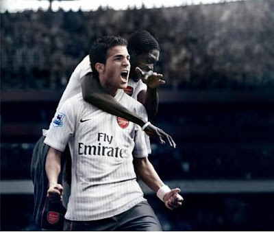
Here's Arsenal's new 3rd kit. They might use the old 08/09 shirt as their home kit. Frankly, I really love Arsenal's 08/09 home kit. Unfortunately, I'm not an Arsenal Fans.
 As simple as usual, Arsenal's 3rd kit.
Then, we'll move to London, to see what Arsenal, Chelsea and West Ham and also Tottenham Hotspurs new shirt look like.
Here's Arsenal's new 3rd kit. They might use the old 08/09 shirt as their home kit. Frankly, I really love Arsenal's 08/09 home kit. Unfortunately, I'm not an Arsenal Fans.
 As simple as usual, Arsenal's 3rd kit.
Chelsea. As blue as always, but with a brand new style of shirt, produced by Adidas. Prefer 07/08's home shirt though. Take a look at it.
Then, about other Londoners. West Ham United shirt's so 90s! Remind me a lot of United's shirt back in 1990. And Spurs did not make lot of difference on their shirt, but, the yellow strip over the white home kit simply needless, but it matched with the 3rd kit. There's some change in their sponsor, WHU changed their shirt sponsor while Spurs add some more writing on their sponsor logo.
Away we visit home of the Beatles, Merseyside, Liverpool. Curious about 5 times Champions League new outfit? Well, it seems that they won't change their home kit, instead they introduce an classy black away kit.
How about their hometown fierce rival? They introduce something better than they have before. A brand new home shirt, which is a nice one, though the white-V-shape on the neck quite not good.
Last but not least, last season's 5th place, Aston Villa. As simple as usual. Remember, it's Nike's. But still, it's better than last season's. And, they replace the sponsor with the new one.


No comments:
Post a Comment